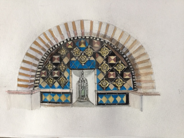
The main news has to be that we are booked in for this year’s Art Wave in late August. Peter meanwhile has some postcards of Andalucian villages and Moorish design made during a holiday in February included in an exhibition of postcards in Eastbourne, held under the aegis of the Devonshire Collective gallery and workshop. Here’s one of the postcard designs.
Liz has now joined a print group there and is being encouraged to use new techniques such as monoprinting and collagraphy. Currently she is working on lino/woodcuts of The Owl and the Pussycat and Lewes Castle.
Peter’s picture of Lewes station’s defunct signal box is destined for the Runaway Café on platform 2. He has done a commissioned painting of Chalcot Crescent, Primrose Hill; two studies of Blakeney shore line (another short holiday); further studies of our nearby Norlington Lane; more small paintings on 18x 13cm panels of ‘things’ bringing the total to 24 (see the Portfolio) and a set of drawings featuring early C20th moderns (James Joyce, T. S. Eliot, Bertolt Brecht and others).
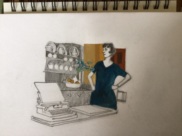
‘The tiniest place imaginable’. Vivien (Vivienne) Eliot with Eliot’s first corona typewriter in their flat in Crawford Mansions, Marylebone.
He’d like to find a way of introducing a sense of movement, a changed angle or elementary narrative into otherwise stationary views, making them more like movie stills or frames in a comic strip. Perhaps this is one way.
Our visits to galleries and shows have been sparing (though we have seen a lot of films) but have included the exhibitions of Anni Albers’ work and Pierre Bonnard’s paintings, both at Tate Modern, and a double exhibition at Charleston, practically on our doorstep. So here’s a few words on these.
Anni Albers at Tate Modern. This comprehensive exhibition was a revelation in its display of the range of Albers’ innovative work in weaving first as a student and then, alongside Joseph Albers, as a teacher at the Bauhaus in Weimar and subsequently at Black Mountain College in North Carolina. She is renowned for her technical experiment and geometrically patterned weavings. Of particular, additional, interest, brought out in the exhibition, was her creative investigation of the relationship between pre-written languages and text and textiles and the representational and abstract qualities of woven threads resulting in her ‘pictorial weavings’. In later work she further investigated the visual and structural affinities between weaving, 3-D design and architecture. The overall impression was of an adventurous, productively sustained project which crossed boundaries, including the gendered compartmentalisation of weaving as domestic and female.
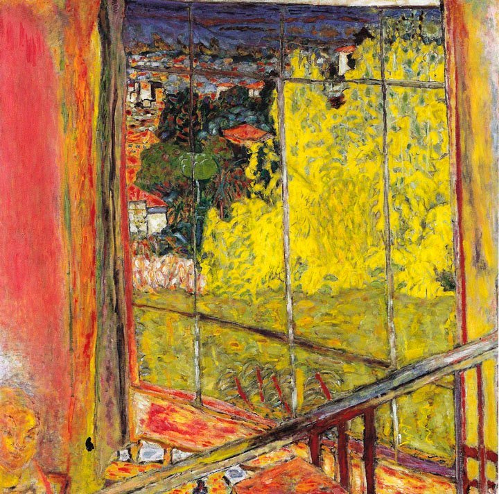
Pierre Bonnard. The Colour of Memory. Tate Modern.
We visited this exhibition with friends Marc and Sharon. It covered Bonnard’s career from the 1900s to the mid1940s. His own words ‘I leave it … I come back’ and ‘the presence of an object … is a hindrance for the painter’ are an apt description of his practice. Objects, interiors and landscapes were regarded as starting points, prompting an exploration of colour rather than a pursuit of representational fidelity. Clearly Bonnard was reluctant to ‘finish’ a work, either in its surface or as a statement. Characteristically he would prolong or revisit a work, even over several years, in a search for the emotional inspiration of its beginnings. A striking prose example of this was his late work Correspondances (1943), a series of fictional letters between members of his family, set in the 1890s, a period of happiness when he met his life-time partner and the subject of much of his painting, Marthe de Méligny.
What was our opinion? Here, clearly, was an oeuvre of commitment, integrity and originality. The paintings expanded our knowledge and in some ways challenged our taste and expectations, but did not (Peter would say) present a model to follow.
In Colour. Sickert to Riley; Philip Hughes. Charleston.
Charleston Trust currently stages two exhibitions in the newly converted barns, a striking addition to the Charleston experience. We went along with our younger son Joe who was down for Easter.
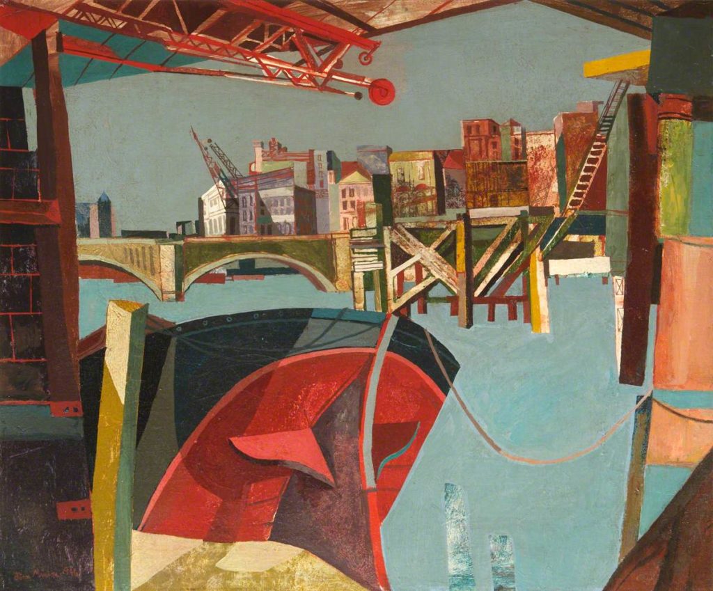
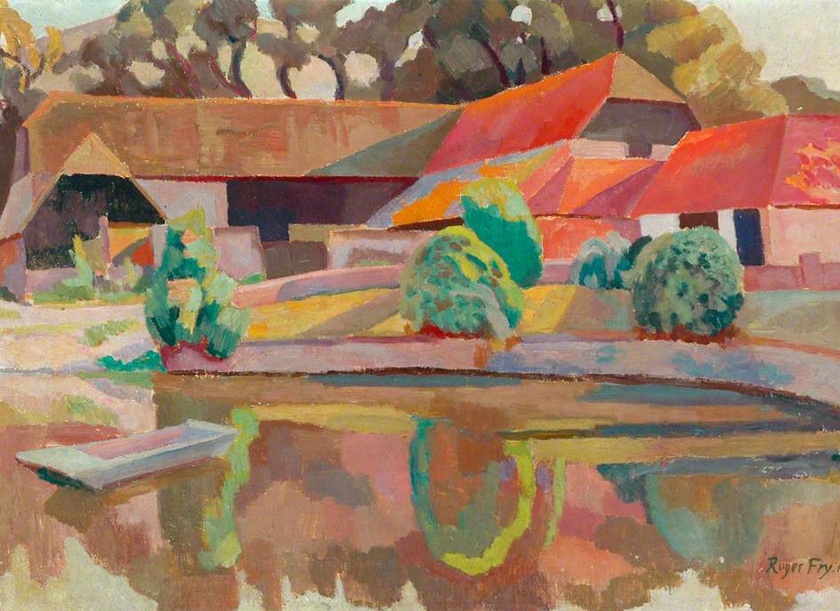
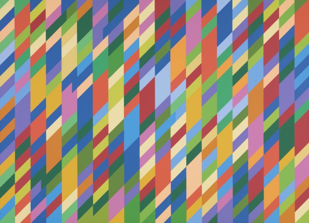
In Colour is curated by Cressida Bell, and presents a personal selection of over 20 works from the 1900s to the 1990s (book-ended by Walter Sickert and Bridget Riley) of interest in their use of various colour palettes, including the Charleston members Vanessa Bell and Duncan Grant and associate Roger Fry. The works themselves, not surprisingly across the span of several decades, are quite different in their subjects and execution. We found ourselves choosing favourites. Amongst many paintings she enjoyed, Liz picked out Roger Fry’s and Vanessa Bell’s views of Charleston pond, respectively from 1918 and 1919; Peter chose Euan Uglow’s ‘Quince’ (1988) and John Minton’s ‘Bridge from Cannon Street Station’ (1946) and Joe liked Bridget Riley’s abstract ‘Sapphire 2’ (1995).
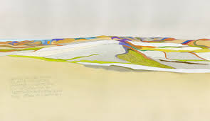
The second exhibition was a thrilling introduction to Philip Hughes’s ecologically inspired landscapes. He has travelled, studied and painted across several continents including Antarctica and the works shown here were of the East Sussex Downs and St Ives, beautifully and precisely sketched in situ and selectively painted in bright segments, often across large sheets of rare, roughly textured paper. In a word they are terrific; not least as a fitting accompaniment to ‘In Colour’ next door. See his work if you can.